

The Best App Store Screenshots and What They Share
Where to find the best App Store screenshots, the patterns the top listings actually repeat, and how to judge a set before you copy it.
On this page
The best App Store screenshots almost always do three unglamorous things: they lead with the single strongest reason to download, they caption every slide with an outcome instead of a feature name, and they hold one visual system across the whole set. Those three traits show up across very different art styles, which makes them the part worth studying. This post points you at the galleries worth browsing, then names the patterns the top charts repeat so you can tell a genuinely strong set from a merely pretty one.
Search this phrase and you get two different answers stacked together. Half the results are inspiration galleries, like Screensdesign pulling screens from thousands of top apps, Dribbble's app-store-screenshots tag, Appshot.gallery, and recent.design. The other half are tool roundups and a long Reddit thread asking which app makes screenshots. The galleries show finished sets, and the roundups compare the tools for making your own. Both are useful, but they leave a gap in the middle that nobody fills well: what, specifically, the great examples have in common, and which of those traits you should actually copy.
For a caption-by-caption review before you copy a style, the ASO screenshots guide shows how to match each promise to visible app features.
Where to look, and how to read a gallery
Browsing works best when you go in with a question, because a gallery shows every set at the same size and says nothing about how each listing performed. Dribbble and Behance skew toward concept work that was never shipped, so a design can win likes without ever having survived a real listing, so use them for visual ideas and check any pattern against live listings. Screensdesign and recent.design pull from live top-chart apps, which makes them the better place to study what actually converts, since a screen that stayed on a #1 app has earned its keep. Our own apps gallery does the same with the sets we've generated, grouped so you can compare within a category rather than across unrelated apps.
The trick when you open any of these is to look at the first slide alone before the rest. Search results and category pages show only the first two or three screenshots, and a shopper decides there. If the opener doesn't make its case on its own, the polish on slides four through ten never gets seen.
The patterns the top charts repeat
Once you look across categories instead of at single standout sets, the same structural choices keep surfacing. These are the ones worth internalizing, roughly in order of how reliably the best listings honor them.
One argument per slide, ordered by strength. The dominant set structure in our August 2026 corpus of top-chart iOS apps is feature-per-slide, and it runs highest in visual categories: 86% of Photo & Video sets are built that way. Each slide makes one point, and the points are sequenced by importance rather than by the app's own navigation. In the strongest sets the first slide states what the whole app does for the user, while an onboarding screen in that spot leaves the reader to guess.
Headlines that name the outcome. Across nearly every category the leading headline formula is the benefit statement, a line phrased from the reader's side ("Know exactly where your money goes") rather than the builder's ("Spending analytics"). To check a set, read its captions as a list and ignore the art. If the captions describe a change for the user, the set makes its case in words. If they only name features, the reader has to work out why each feature matters.
The standard layout, with the effort spent elsewhere. The plain arrangement of a headline up top and a framed device below it is the default of the entire store. In Finance, one of the most competitive categories, that same August 2026 corpus shows 80% of screens using the text-top, device-bottom layout. You don't have to use it, but the numbers show that most strong sets keep the layout familiar and put their effort into the headlines and the color system.
One visual system, start to finish. The sets that read as premium hold a single palette and one type treatment across every slide, so five slides feel like one listing instead of five separate posters. This is the trait most often missing from concept work that looks great as a single frame and falls apart as a strip.
Honest proof, when it's there. Ratings rows, award laurels, and real user numbers usually appear as small accents on one slide, and they help only when the numbers are real. Store review does check metadata claims, so a fabricated badge can get the listing rejected. If you have a genuine 4.8 with tens of thousands of ratings, a single proof slide earns its place; if you don't, leave the space for the product.
You'll notice what isn't on this list: a specific color or a trendy gradient. Those are surface choices that rotate with fashion. The patterns above have held across the whole corpus, and the category idea pages break down how each one shifts by app type, because a game listing and a banking listing genuinely reward different openers.
Copying the right thing
The common mistake when studying top screenshots is to copy how a set looks and skip how it is built. A finance app that borrows a meditation app's soft-gradient look inherits none of what made that listing work, because the structure underneath (which slide leads, what each headline promises) was tuned to a different buyer. The ordering logic and the outcome-first captions carry across apps. Then set your own colors from your own brand and your own screens. In the corpus, top sets from different categories share that structure while their colors and art are specific to each app. A gallery shows the finished look, so you have to read the structure out of each set yourself.
Where Screenies fits
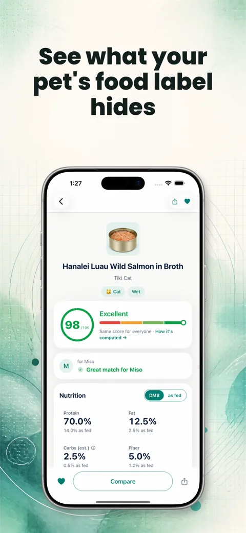
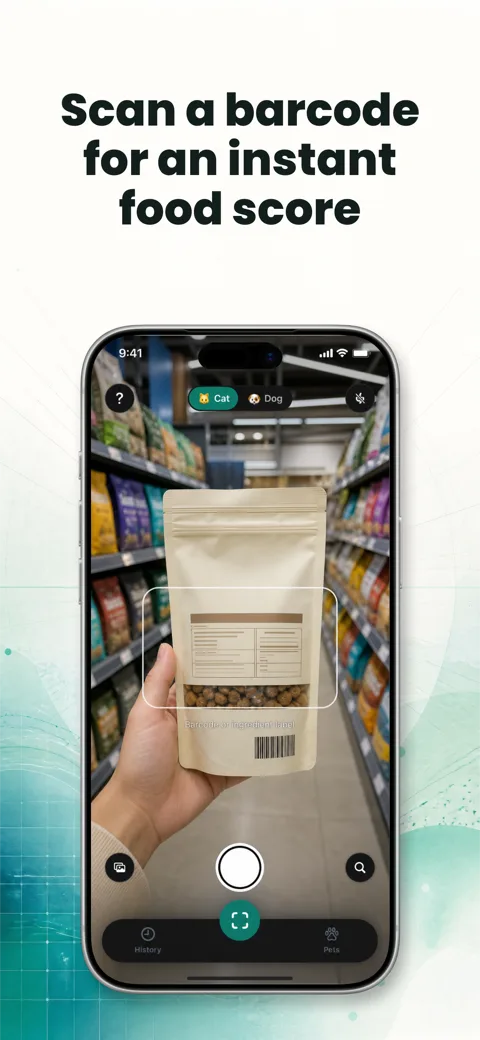
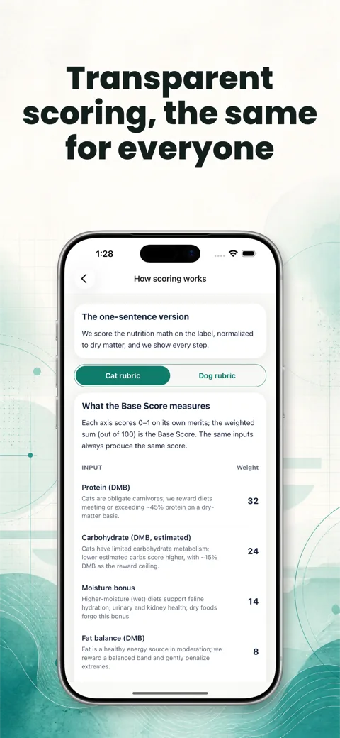
If the patterns above are clear but assembling a set that follows them isn't how you want to spend an afternoon, that planning is the part Screenies does. Give it your real screens and a sentence about the app, and it returns a proposed set with the slide order argued by importance, a benefit-first headline on each slide, and a palette read from your UI. Every slide is built from your captures: each screen sits in a device frame exactly as captured or is rendered into a photographic scene, and nothing is invented. You can generate separate iPhone, iPad, iPhone Duo, Android phone, and Android tablet sets in portrait or landscape. One-time credit packs are on the pricing page.
Create a set from your app screens and review its slide order and headlines.
FAQ
What actually makes one App Store screenshot set better than another?
How well each slide argues for the download matters more than how polished it looks. The stronger set leads with the best reason to download, captions each slide with an outcome, and keeps one visual system throughout. A polished set that opens on an onboarding screen gives the reader less reason to download than a plain set that opens on the app's main benefit.
Where can I find real examples to study?
Galleries that pull from live top-chart apps are the most reliable: Screensdesign and recent.design for shipped listings, and the Screenies apps gallery for captured top-chart listings and screenshot design notes you can compare by category. Dribbble and Behance are fine for mood but include concept work that never shipped.
How many screenshots do the best apps actually use?
Apple allows up to 10, and the top-chart sets in our corpus mostly run 7 or more, with a decisive first three doing the work since search results never show more than the opening slides. Padding with weak slides dilutes the argument; the screenshot count post has the full distribution.
Should I copy the design of a screenshot set I admire?
Copy its structure and use your own colors and art. The slide order and outcome-first headlines transfer across apps; the specific palette and imagery were tuned to that app's buyer and won't carry the same meaning for yours.
Do the best screenshots avoid device frames?
Not as a rule. Framed devices are still the majority in most categories, while frameless full-bleed UI dominates where the interface is the product, like photo and video editors. The choice follows the app, and the layouts glossary covers when each one fits.
See the patterns on your own app
Reading about the patterns is one thing; watching them applied to your screens is faster. Upload your captures to Screenies and see a set that already leads with your strongest slide and captions each one with an outcome, then adjust from there.
Related guides
App Store Panoramic Screenshots: What They Are and When They Work
What a panoramic App Store screenshot set is, how one wide design gets cut into separate uploads, where the effect breaks in search results and on the product page, and how rarely top-chart apps use it.
ASO Screenshots: What They Are and What to Check
ASO screenshots explain an app before download. Learn how to match each claim to real UI, review a set, and separate design choices from test results.
Best MCP Servers for Claude Code: 13 Worth Adding
A working list of MCP servers for Claude Code, each with its install command, transport, and the job it does, from Context7 and Sentry to Playwright, Figma, and Screenies.