

App Store Screenshot Template
Where App Store screenshot templates come from, what the ranking files and web tools include, and how a generated set changes the workflow.
On this page
An App Store screenshot template is a pre-built listing layout with slots for your screens and captions: you fill the slots, export, and upload. Two different products share the name, a design file you edit (Figma or Photoshop) and a web editor with a layout gallery, and this post compares both against generating the set from your UI instead.
Templates exist because Apple's specs leave no margin for error. For iPhone, provide a 6.9-inch set (1320 x 2868, 1290 x 2796, or 1260 x 2736 in portrait) or a 6.5-inch set (1284 x 2778 or 1242 x 2688 in portrait). Landscape screenshots use the reversed dimensions. App Store Connect requires an exact accepted size, so most teams would rather inherit working geometry than draw it from scratch. Details are on the App Store screenshot sizes page.
The two products sold as templates
Design files. Community files like the mockup-plugin template that ranks first for the Figma variant of this query, the 500+ layout pack, or aso.dev's free template. You duplicate an artboard, swap in your screen, retype the caption, and export from your own design tool. Everything is editable because nothing is automated. The Figma-specific breakdown goes deeper on that workflow. For PSD files, the Photoshop template comparison explains Smart Object copies and export checks.
Web editors with galleries. AppScreens, AppLaunchpad, AppMockUp Studio, Screenshots Pro, and Previewed all open with a template browser. You customize inside their editor instead of yours, which trades flexibility for not needing Figma at all. Several add localization workflows and multi-device export on paid tiers, which a static file can't automate.
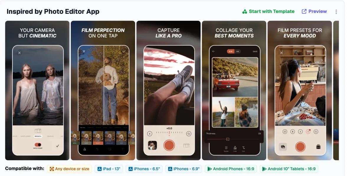
Both give you the same starting position: a composition someone else designed, waiting for your content.
Try the free device mockup tool if your template needs a framed app screen. It exports a PNG for use in your design.
What filling the slots doesn't cover
The slots are the easy part. A listing set still needs a slide order that tells a story, a headline on each slide that states an outcome rather than a feature name, a palette that reads as your brand, and first-three slides that survive being shrunk into App Store search results. No template supplies those decisions; the file arrives with placeholder captions like "Feature One" precisely because the author couldn't know your app. Teams that budget an hour for "drop screens into the template" usually spend the afternoon on everything the template left open.
There's also a convergence problem. In News, 89% of the screens we measured use the same text-top layout that nearly every template pack defaults to, so a stock pack makes you look like the category median on your best day. Differentiation has to come from the copy and the art direction, which are the parts the template doesn't do.
Keeping a template current
Design files go out of date without warning you. When Apple moves the required pixel sizes, every pack that wasn't updated afterward keeps exporting dimensions App Store Connect refuses for the primary set, and nothing in the file tells you so until the upload fails. Web editors handle spec updates for you, which is a genuine advantage of the gallery tools over the files, but you're then renting the editor for as long as the listing needs maintenance. Localization multiplies the work either way: a design file needs duplicated artboards per language, and most web-tool localization means retyping captions per locale in their editor.
Template or generated set
A template suits you when you want to make every visual decision yourself and just need correct geometry to start from. If you already have strong brand direction, a designer, and one language, the file route stays attractive.
A generator suits you when the decisions are the part you want handled. Screenies reads your uploaded screens and your app description, then designs the whole set (order, headlines, palette, scenes and props) around your captures. There's no gallery step, and headline edits after generation don't require regenerating the artwork. One-time credit packs are on the pricing page, with no subscription.
The real difference between the two workflows is who art-directs: with a template every visual and copy decision is yours, while a generator proposes a complete set that you then adjust. If staring at a blank caption box is where your listing projects stall, the second workflow is the one that changes your output.
Common questions
Are paid template packs better than free ones?
Payment buys polish and sometimes maintenance, not correctness. A free pack with current export sizes beats a paid one exporting 2024 dimensions, so check the pixel sizes against the sizes page before judging by price.
Do I need a separate template for every iPhone size?
You don't, because Apple accepts either a 6.9-inch or 6.5-inch set and scales it down to smaller iPhones. iPad listings need their own 13-inch set if the app runs there.
How many slots should the template have?
Apple accepts 1 to 10 screenshots. Fill the first three carefully, since those show in search results; a tight five-slide story usually beats a padded ten.
Can a template handle localized listings?
Only manually: duplicate the artboards or gallery project per language and retype. If you localize into many languages, check what each web tool automates on its paid tiers before assuming the feature exists.
Does Screenies use templates internally?
It doesn't; each set is planned per app from the uploaded screens and app description rather than assembled from a fixed layout library.
Can I mix approaches?
You can, and nothing stops you from generating a set, then recreating or adjusting a slide in Figma if one screen needs custom illustration, since the exported PNGs are yours.
Start from your screens instead
If the template's blank caption boxes are the part you dread, upload your screens to Screenies and react to a drafted set rather than assembling one. Reviewing a complete draft takes less time than making every layout and copy decision yourself.
Related guides
AppLaunchpad Alternative: Template Editor or Generated Set?
Compare AppLaunchpad with AppScreens and Screenies on price, templates, device sizes, localization, and upload before you move a screenshot project.
Photoshop App Store Screenshot Template: PSD or Generated Set?
Compare a Photoshop PSD template with a generated screenshot set. Check Smart Object copies, editable captions, and exports before building every slide.
Figma App Store Screenshot Template
How the popular Figma Community screenshot files actually work, the mockup-plugin workflow they assume, and when generating beats maintaining the file.