


How to Make App Store Screenshots
A step-by-step process for turning raw app captures into an uploaded App Store listing set, from simulator capture to App Store Connect.
On this page
Making App Store screenshots takes five steps: capture real screens from your app, pick the three to five that sell it, write a headline for each, compose them into framed listing images, and export PNGs at a size App Store Connect accepts. The capture part takes minutes; the middle three steps are where listings are won, and this guide walks through all five in order, with the Apple rules that apply at each one.
Search this query and you'll find mostly tool homepages and a decade-old Stack Overflow thread, so it's worth stating what the finished output has to be before any tool enters the picture. Apple wants 1 to 10 portrait or landscape images per device class, flattened PNG or JPEG with no transparency, showing the app in use. For iPhone, provide either a 6.9-inch set (1320 x 2868, 1290 x 2796, or 1260 x 2736 in portrait) or a 6.5-inch set (1284 x 2778 or 1242 x 2688 in portrait). Landscape uses the reversed dimensions. Apple scales the set down for smaller phones. This guide uses a 6.9-inch portrait set. The full matrix lives on the App Store screenshot sizes page.
Step 1: Capture clean screens from the real app
Run the app in the iOS Simulator on the largest iPhone and press Cmd+S, or capture on a physical 6.9-inch device. Before you do, stage the content: seed realistic demo data, set the clock and battery to something tidy (the simulator's status bar overrides help here), and switch to the account state you want strangers to see. Empty states, placeholder avatars, and "Test User 3" in a capture will follow you through every step after this one.
Capture more screens than you'll use. Ten candidates covering every major surface of the app cost nothing now and save a re-staging session later when you decide slide four should show search instead of settings.
One rule matters most at this step: the UI in your listing has to be the app's real UI. Apple's guideline 2.3.3 covers screenshots that misrepresent the app, and the top-ranking thread for this exact query is a developer whose submission was rejected for polished screenshots that no longer matched the product. Beautifying the frame around your capture is fine; redrawing what's inside it is not.
Step 2: Choose the slides and their order
You're building a short pitch, so order by argument, not by app navigation. The first screenshot carries the most weight because search results and category pages show only the first three, and many people decide there without ever opening your product page. Lead with the single strongest reason to download, follow with the two next-strongest, and let slides four onward reward the people still scrolling.
Most top-chart apps structure this as one feature or benefit per slide rather than a continuous story. Pick the screens that prove each claim: if the claim is "know where your money goes", the slide shows the spending breakdown, not the onboarding carousel. Category-by-category examples of what leading apps put first are collected under App Store screenshot ideas.
Step 3: Write the headlines
Each slide gets a short caption, and the caption does more selling than the screen under it. Phrase outcomes, not feature names: "Never miss a renewal" beats "Subscription tracking" because it tells the reader what changes for them. In our August 2026 corpus of top-chart iOS apps, benefit statements are the most common headline formula in Productivity at 51% of screens, ahead of imperatives and plain feature names. Keep each headline short enough to stay readable at search-result size; under about 45 characters is a good working cap. The headline formulas pages break down the patterns with real examples per category.
Write all the headlines together, in order, before touching layout. Reading them as a sequence is the fastest way to catch a pitch that repeats itself or buries its best argument on slide five.
Step 4: Compose the listing images
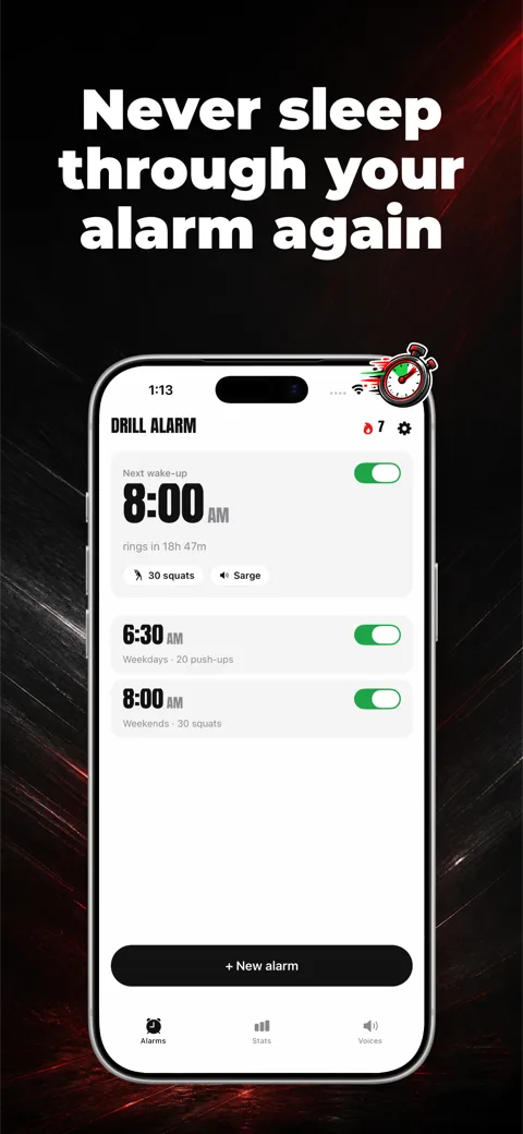
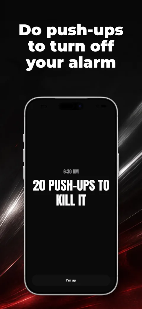
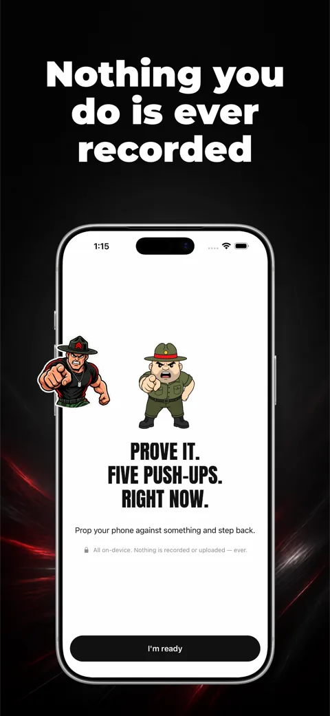
Now the captures and captions become designed frames. The dominant pattern is simple: headline at the top, device-framed screenshot below it, brand-colored background behind both. That arrangement, text-top with the device below, covers 78% of Productivity screens in the corpus, and its grip is similar in most non-game categories. You can follow it and compete on copy and color, or deviate deliberately if your category rewards it.
Three composition rules earn their space here. Keep one visual system across the whole set, meaning one palette, one type treatment, one device angle, so the five slides read as one listing instead of five posters. Keep text and device inside a safe margin, because App Store Connect previews crop nothing but small screens make edge-hugging text illegible. And keep any ratings or awards chrome honest, since invented badges are the kind of metadata problem App Review does check for; the requirements page lists what else gets checked.
For the actual assembly you have three tool routes. A design tool like Figma with a device-mockup file gives full control and full responsibility; we've covered the template workflow and the Figma-specific version of it separately. Web editors like AppLaunchpad or AppScreens trade some control for prebuilt layouts and spec upkeep. Generators plan the set for you from your captures, which is the route Screenies takes.
Step 5: Export and upload
Export each frame as a flattened PNG at exactly one of the accepted 6.9-inch sizes, then verify the pixel dimensions of the actual files rather than trusting the export preset. In App Store Connect, open your app's version page, choose the iPhone 6.9" display tab under App Previews and Screenshots, and drag the files in; the order there is the order shoppers see, and you can reorder by dragging. If your app runs on iPad, that 13-inch set is a separate upload with its own sizes. Localized listings take a separate screenshot set per locale, which is worth knowing before you design text into fifty images by hand.
Screenshots go live with the version they're attached to, so a screenshot-only refresh on a released app still requires submitting a new version for review.
Check your exported screenshot sizes before you upload them. The checker runs in your browser and needs no account.
Where Screenies fits in this process
Screenies collapses steps 2 through 5 into one pass: upload your captures, describe the app, and it plans the slide order, writes the headlines, and builds each slide from your own captures, with scenes and props generated around one visual concept for your app. Generate separate iPhone, iPad, iPhone Duo, Android phone, and Android tablet sets, in portrait or landscape, from matching source captures. Headline edits after generation are free. You can upload Apple sets to App Store Connect or Google Play sets to Google Play from the dashboard. One-time credit packs are on the pricing page.
FAQ
Can I just upload raw simulator captures without frames or captions?
Yes, Apple accepts plain captures at the right size, and some strong apps ship exactly that. You give up the caption layer, which is the main persuasion tool the listing has, so it suits apps whose UI explains itself at a glance.
Do I need different screenshots for every iPhone model?
No. One 6.9-inch set covers all iPhones; Apple downscales it for smaller displays. A 6.5-inch set is also accepted instead. You can upload separate sets for other iPhone display sizes, but these are optional. Apps that support iPad need a separate 13-inch iPad set.
How many screenshots should I actually make?
Apple allows up to 10, and top-chart apps mostly use 7 or more, but a strong first three matters more than the total because nothing after them affects search results. Upload as many slides as you have distinct reasons to download; how many screenshots for the App Store has the full distribution.
What DPI or color profile do the files need?
Pixel dimensions are what's checked, not DPI. Export sRGB PNGs without transparency and you're within spec; the exact accepted dimensions are on the sizes page.
Can screenshots show features behind a paywall?
Yes, as long as the features exist in the build and the screenshots don't misrepresent what's free. Review flags invented functionality, not premium functionality.
How often should I update screenshots?
Whenever the pitch changes: a redesign, a headline feature, or repositioning. Since updates ride along with version submissions, batching the refresh with a release costs nothing extra.
Generate a set you can review and edit
If you have the captures from step 1 and would rather spend your judgment approving a set than building one, start a set in Screenies and edit the drafted headlines until they match your pitch.
Related guides
App Store Landscape Screenshots: When to Use Them and How to Make Them
How to decide whether your App Store listing should use landscape screenshots, the landscape sizes Apple accepts for iPhone and iPad, how to capture wide screens in the Simulator, and how to lay out a slide that's wider than it is tall.
iPad Screenshots Without an iPad: Capture Them in Xcode Simulator
Boot the 13-inch iPad Pro in Xcode Simulator, tidy the status bar, and save captures that already match an accepted App Store size, with no iPad on your desk.
Generate App Store Screenshots With Codex
Register the Screenies MCP server with codex mcp add, set the approval mode and sandbox network access once, and let Codex turn your Simulator captures into an App Store screenshot set.